naming process, visual identity, art ad photo direction, tone of voice, digital strategy, architecture consultant and stationery and packaging design. odara is a brazilian cafe and bakery wich values it’s tropical roots, handmade goodies, sazonal products and excelence in every aspect.
colors + material pallete were designed


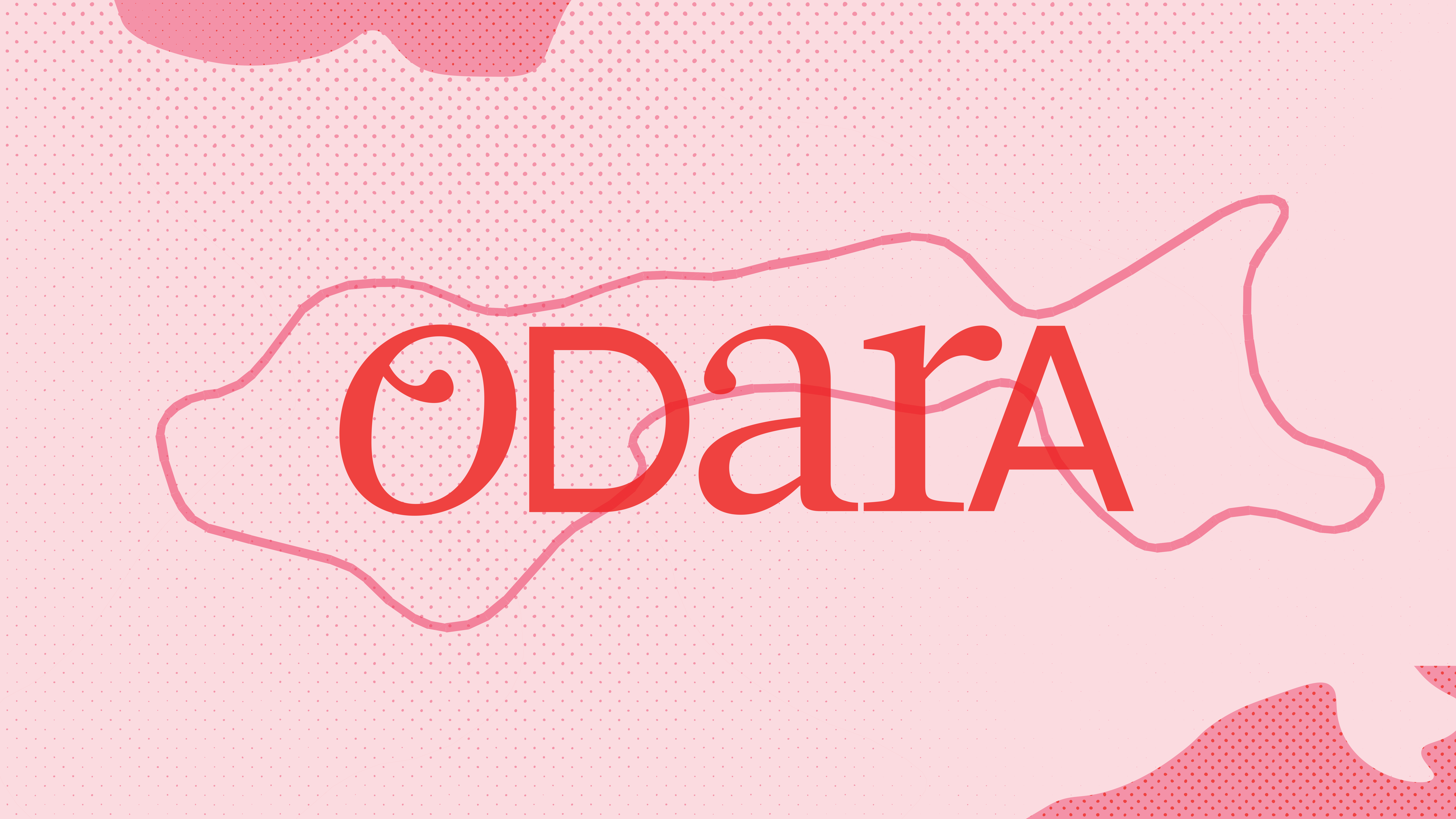
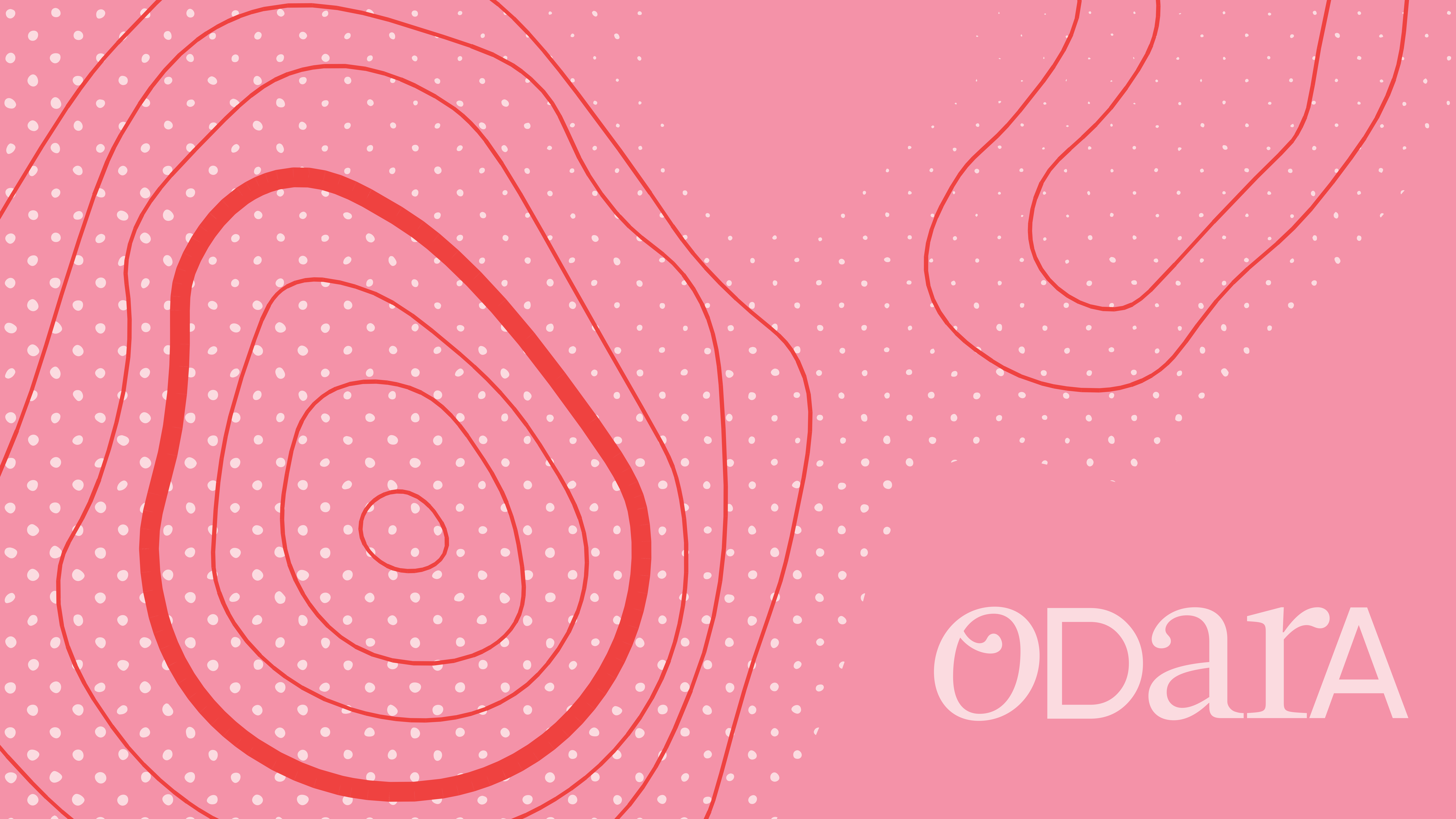
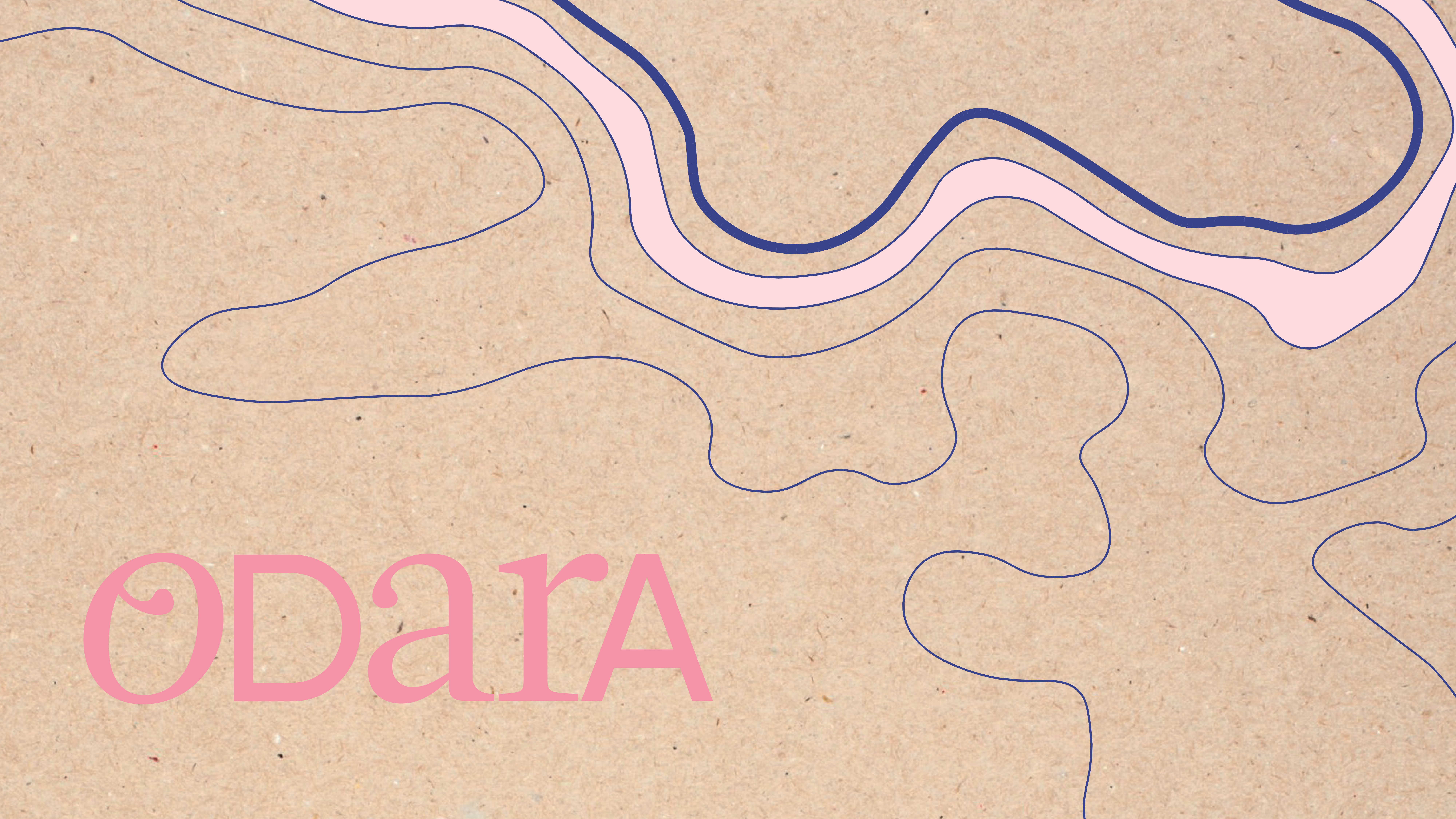
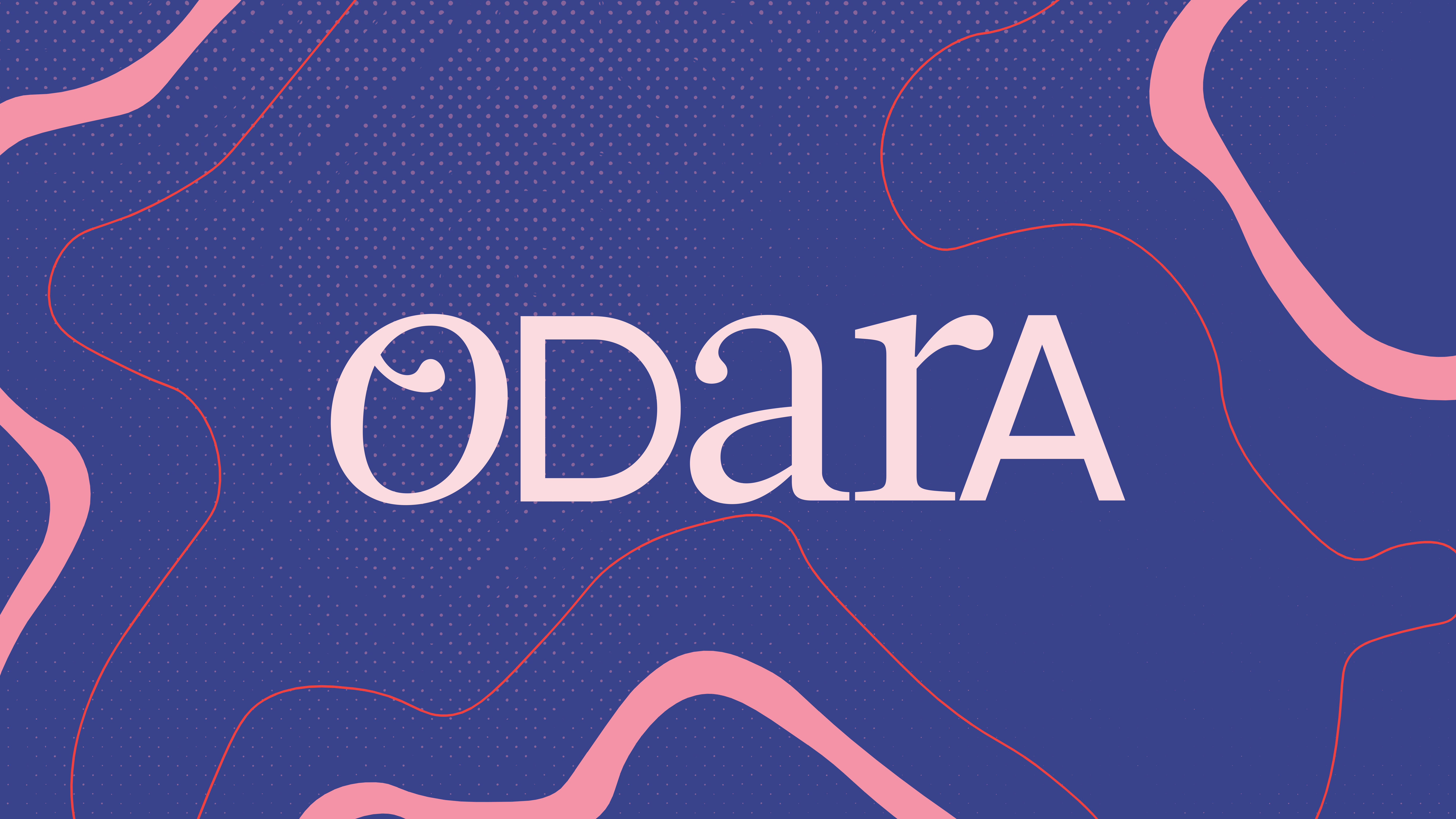
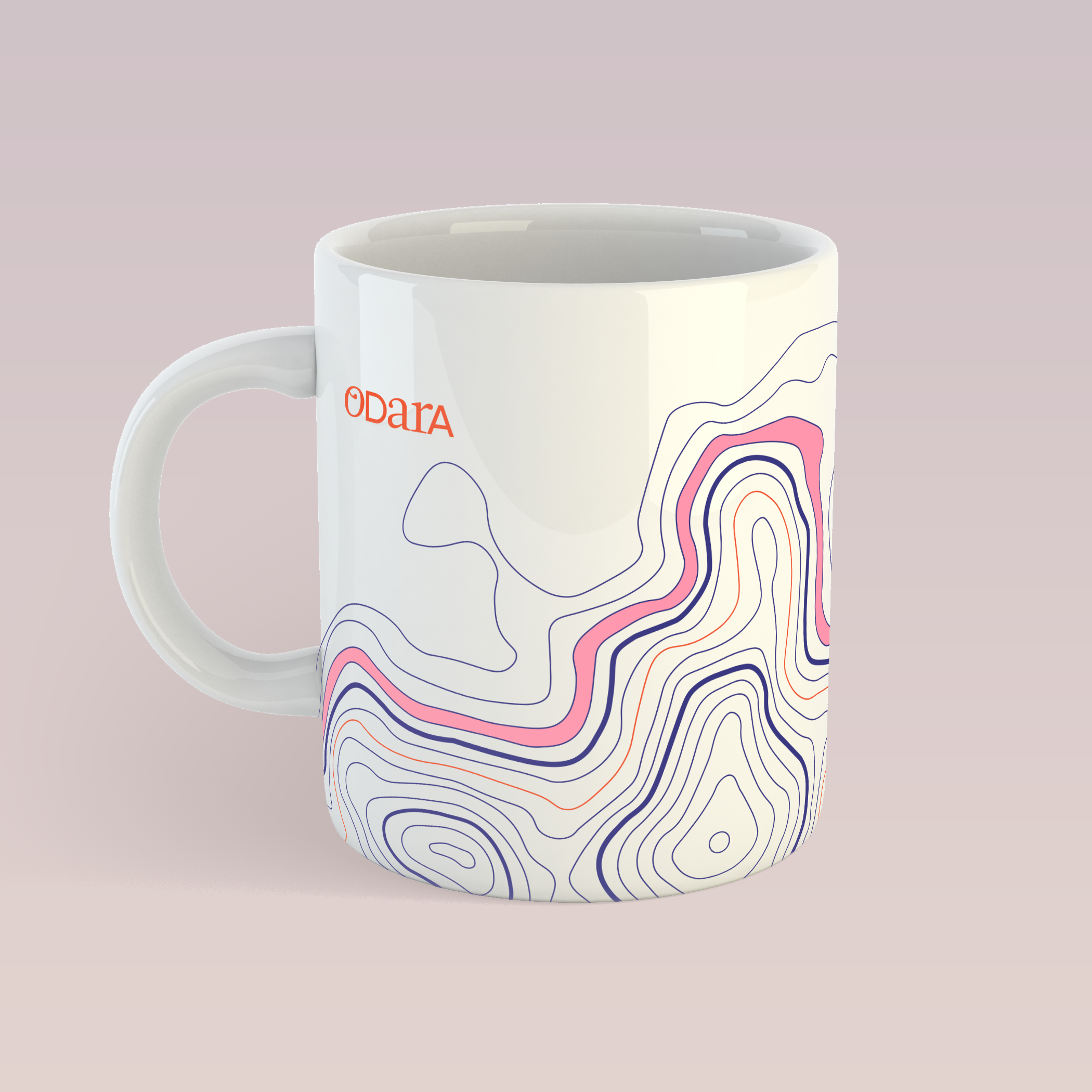
the lines that work as a graphic element are always derived form this illustration, a custom made topographic map of the city the brand was born.![]()
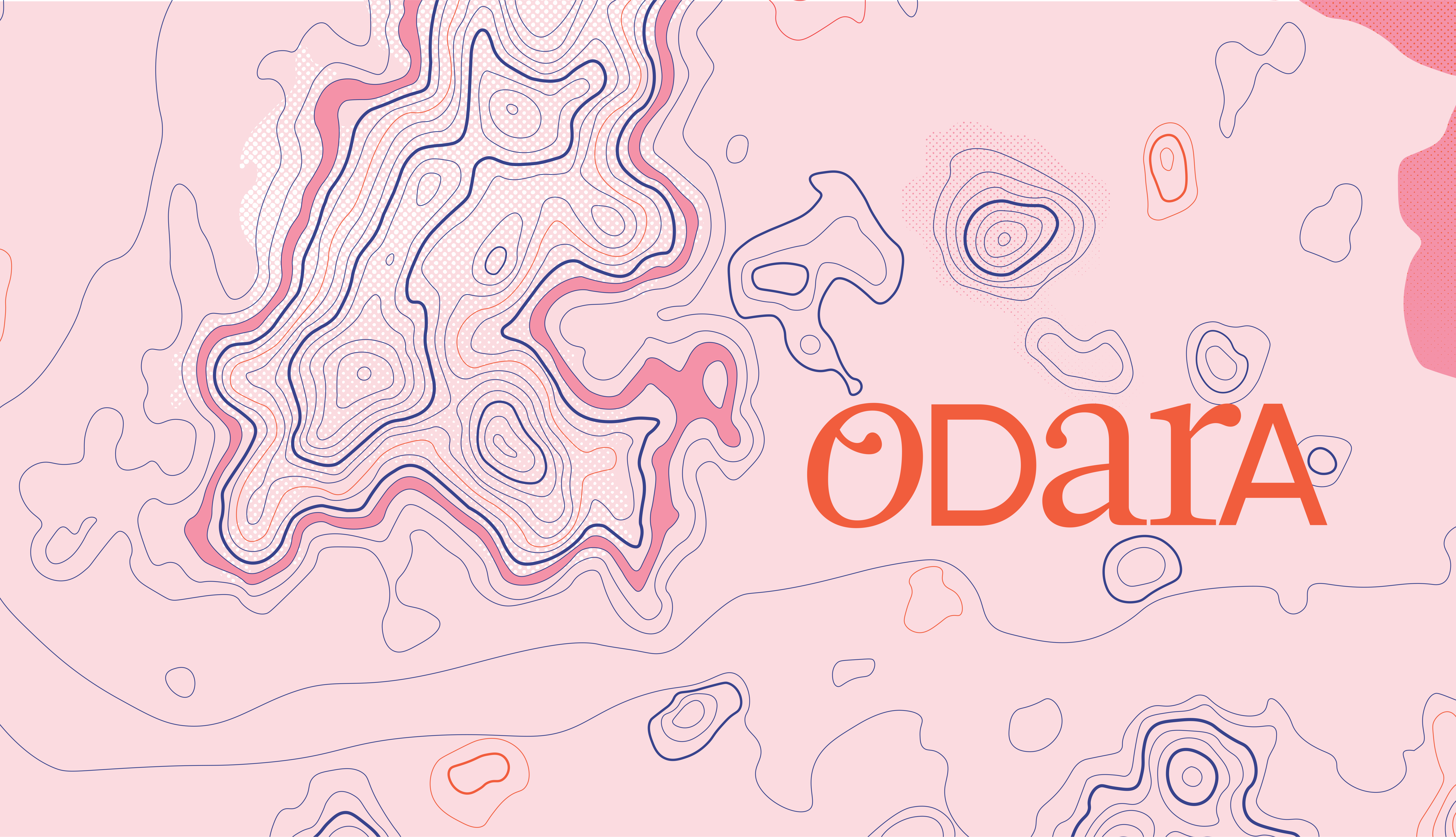
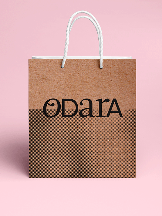
colors, halftone texture and kraft paper textures are also among it’s proprietary graphic elements:

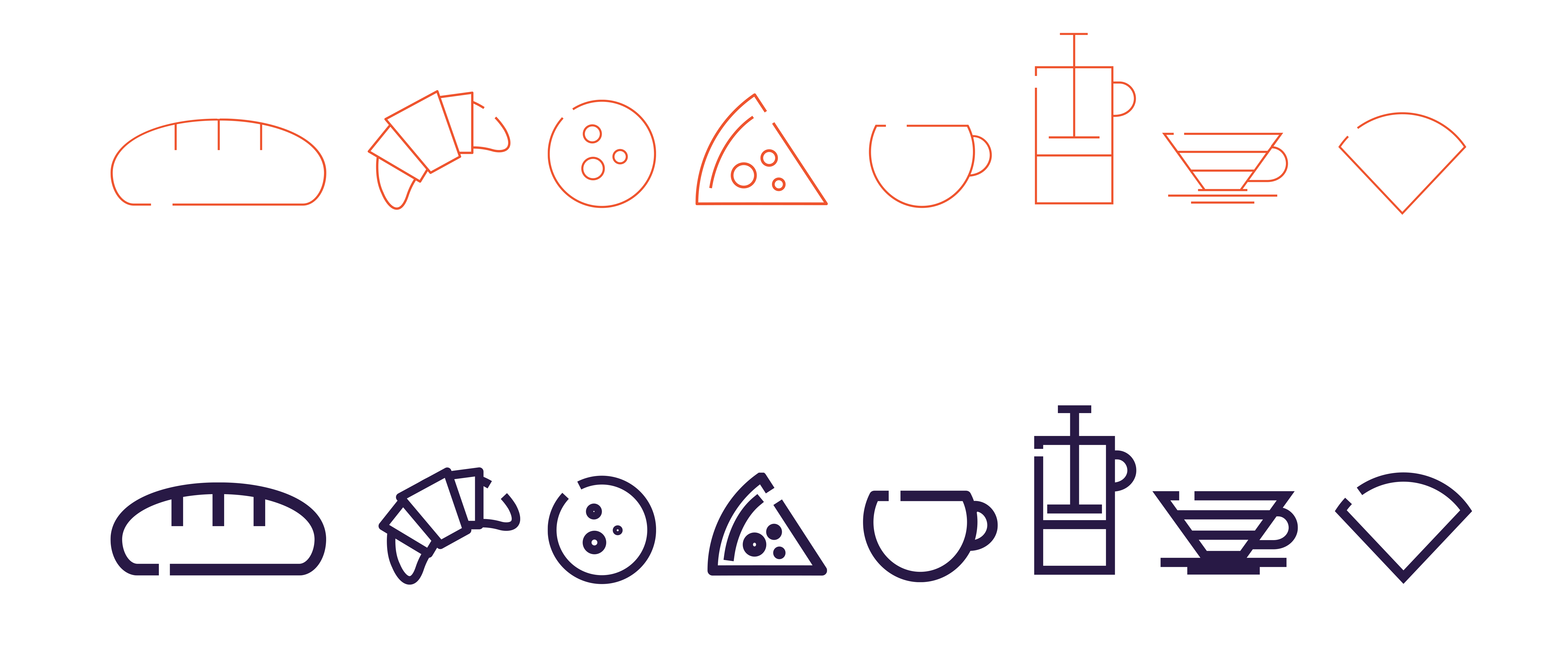
an exclusive icon family was designed:
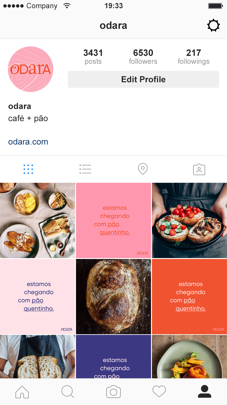
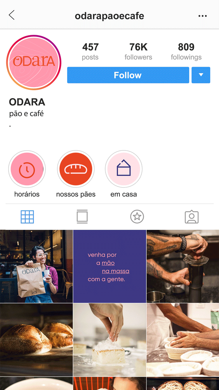
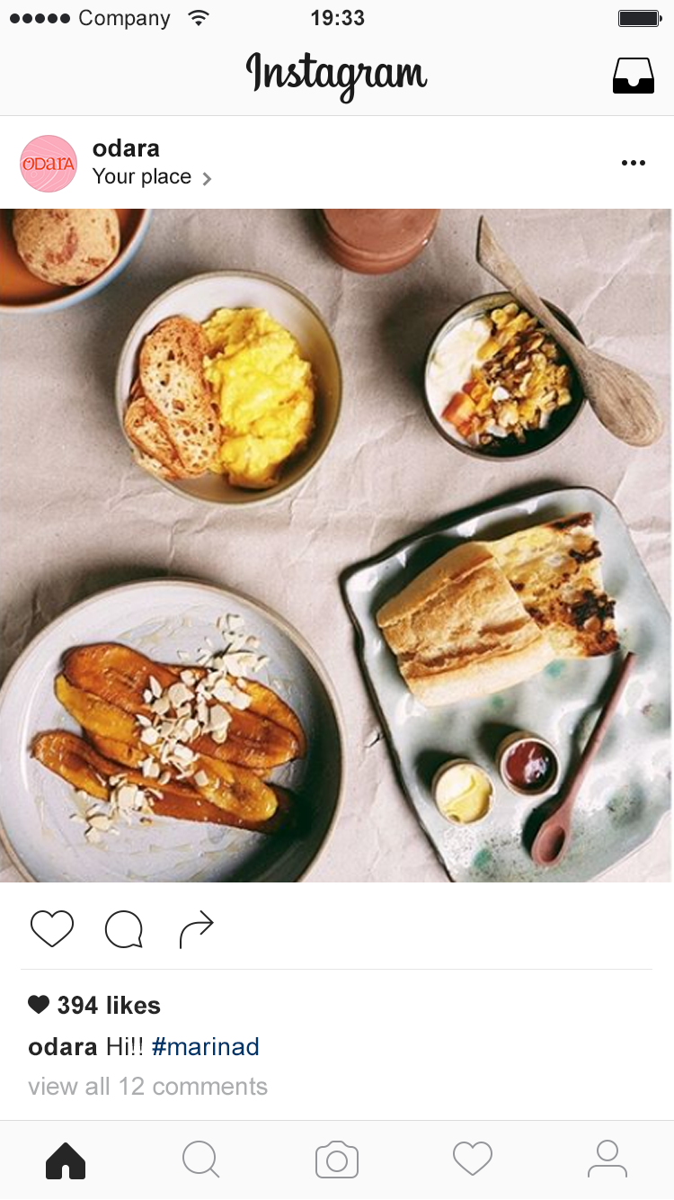
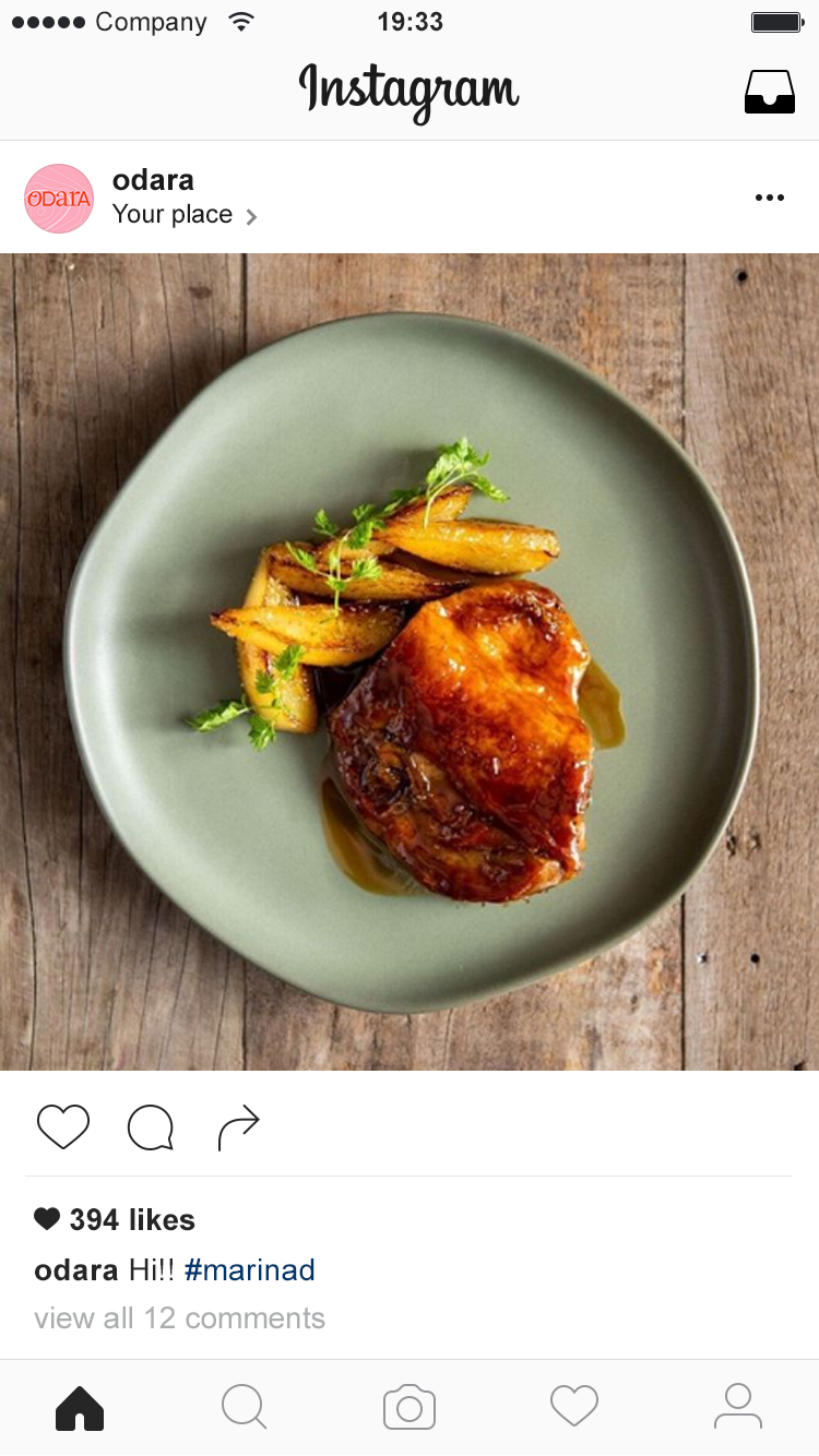
online presence is key to the brand. we designed feed and stories layouts as well as the photo direction to keep all visuals cohesive.

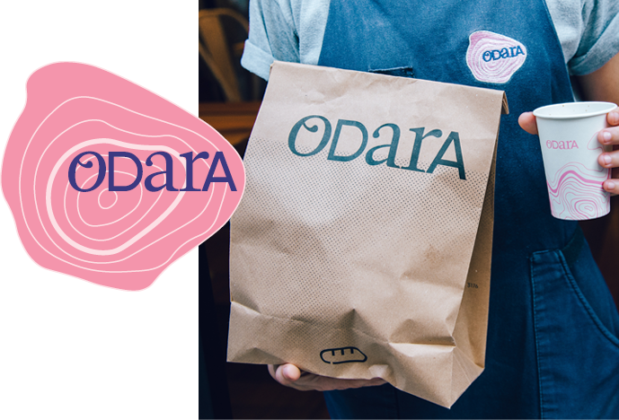
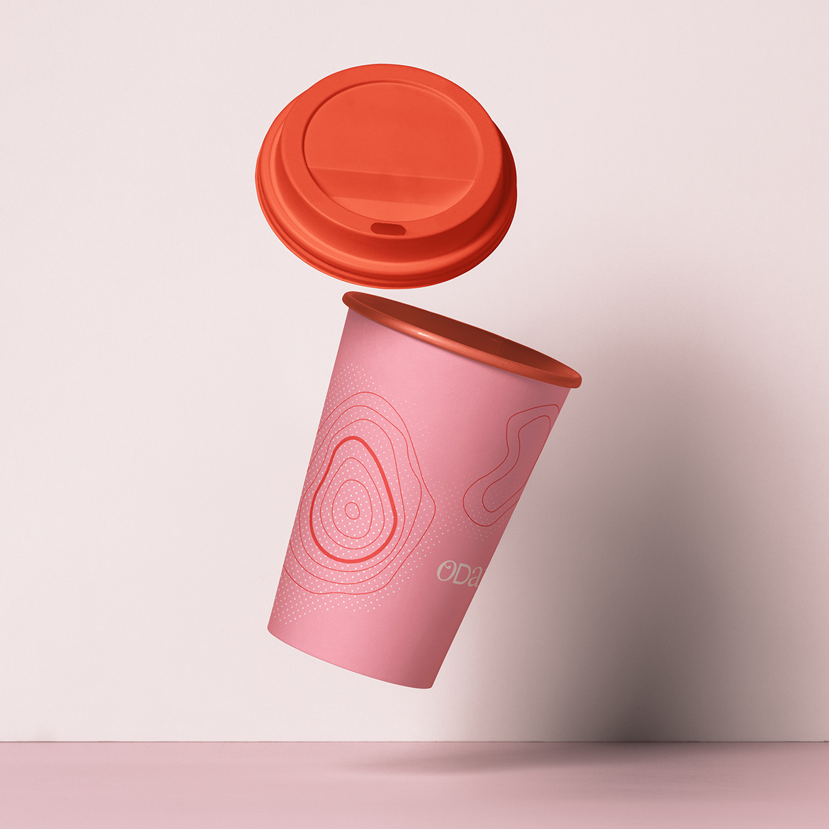
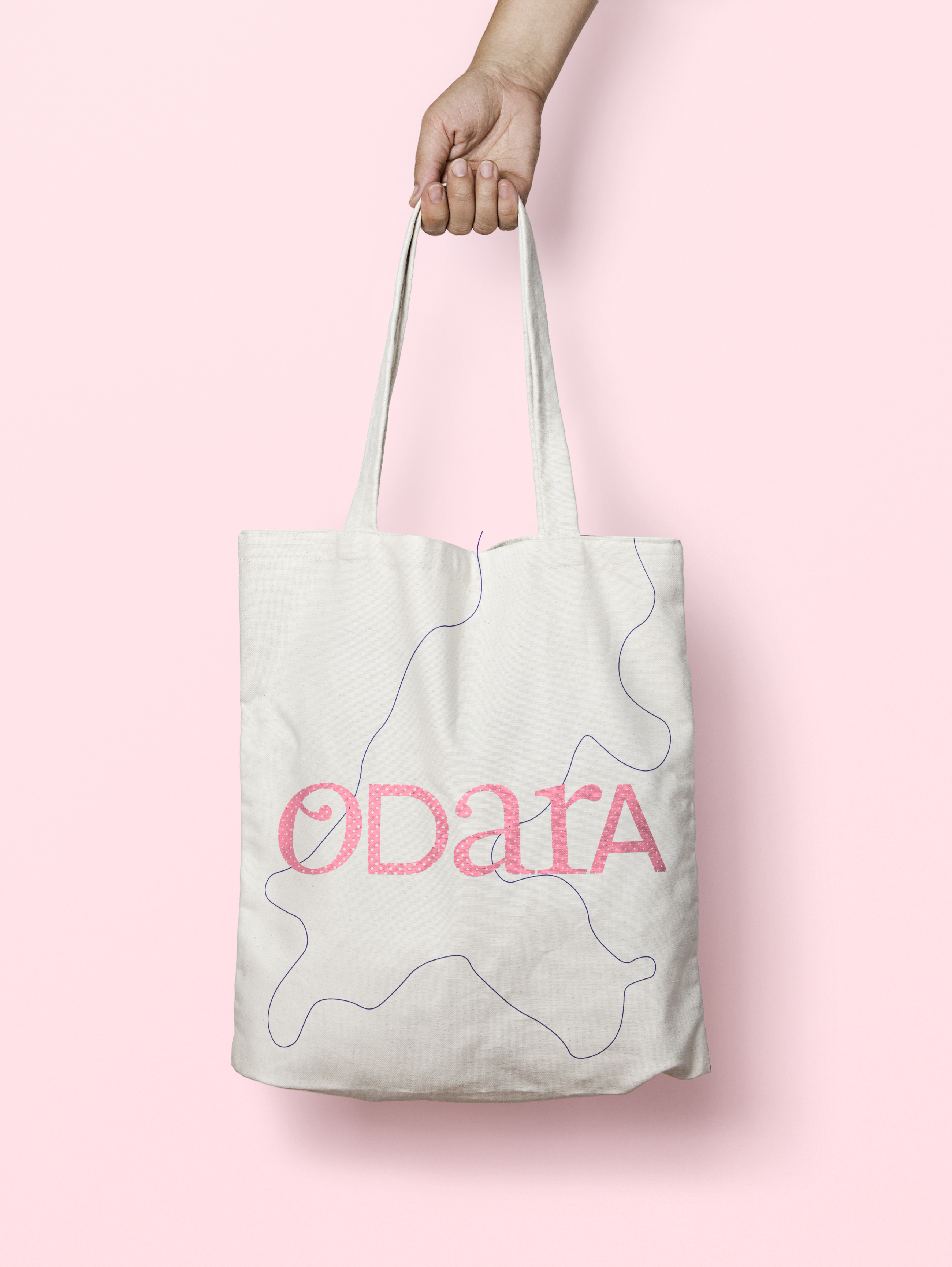
mugs, travel cups, paper, bags and other stationary were also created to enhance brand strenght:


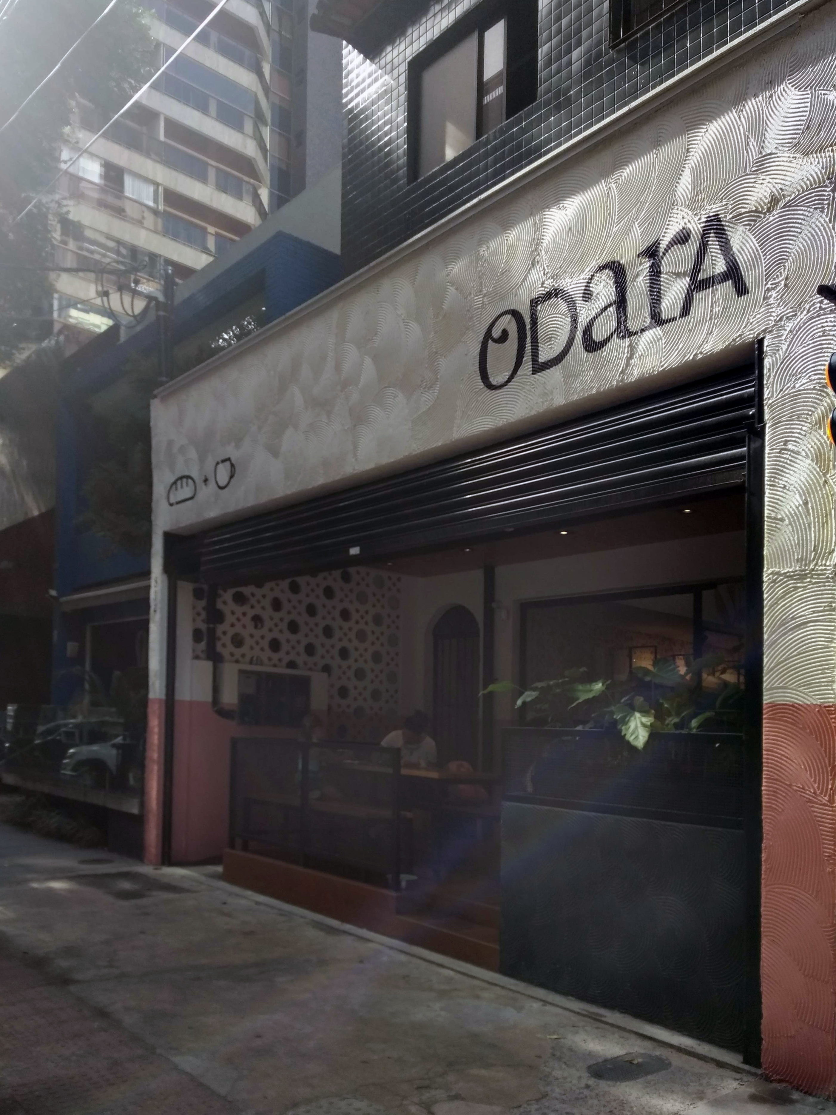
photos of store facade and other details:
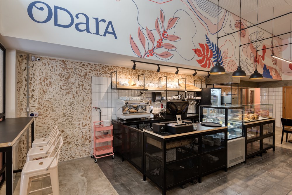
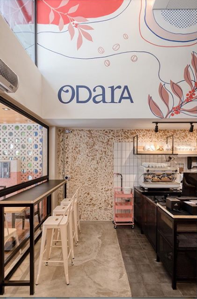
architecture + interior project: studio gamboa. interior mural illustration: locomotipo.