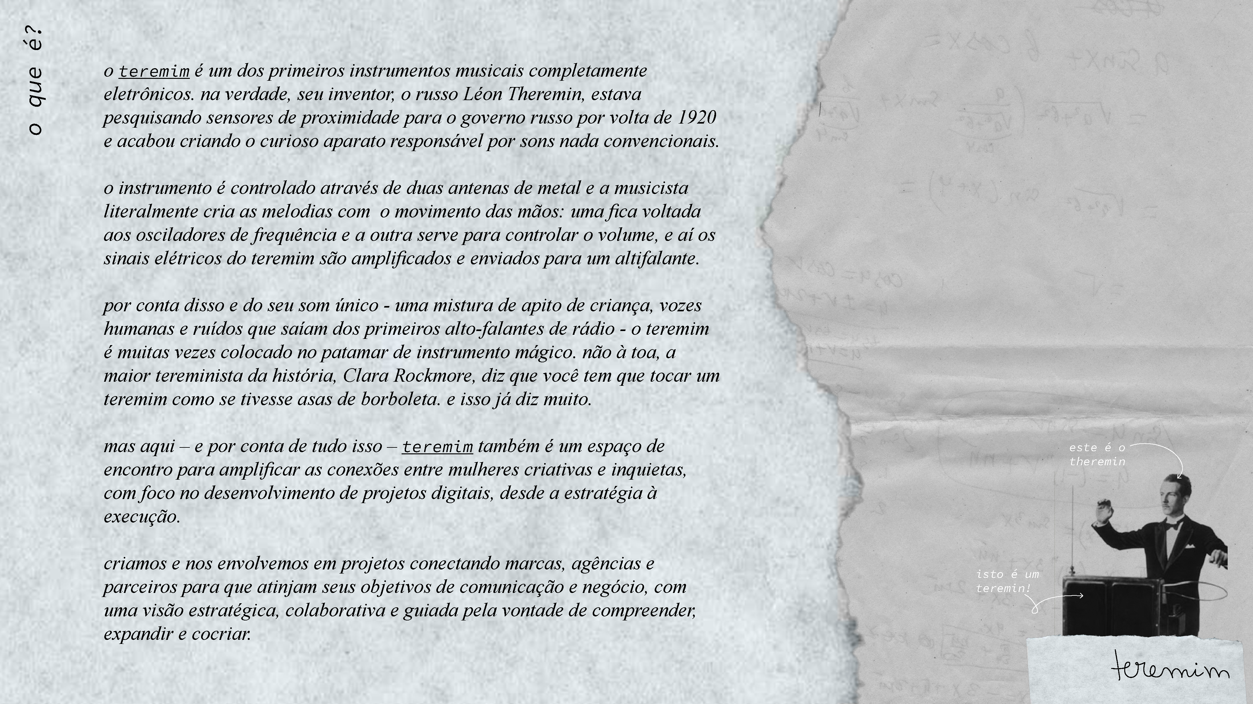
visual identity and digital visual assets for teremin, a digital communications agency and woman’s professional network hub.
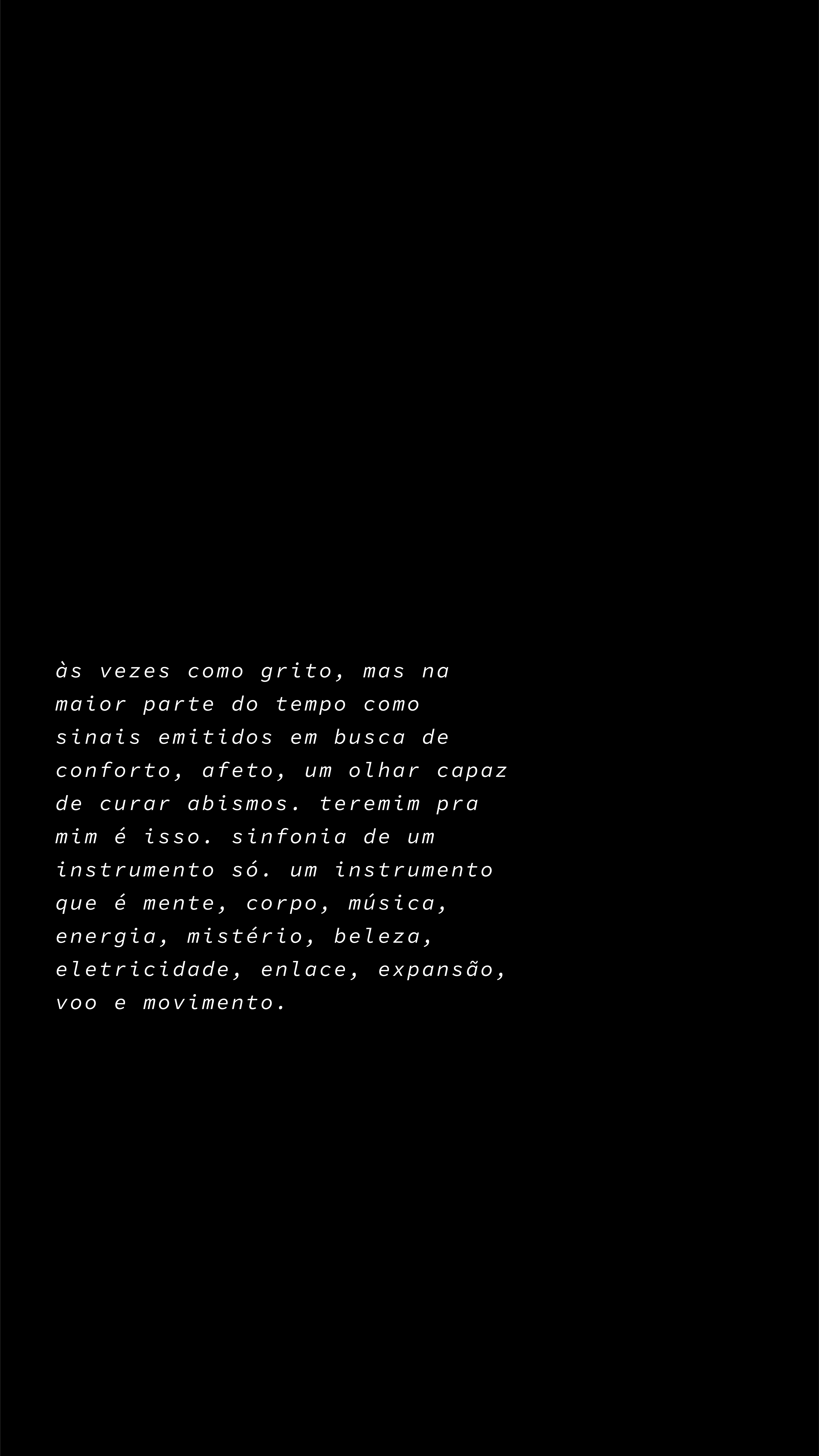
theremin is an eletronic instrument created by russians which works through hand gestures on the air that create a variety of frequency waves to make music. it needs tenderness to be played. the sound is unique and has a gloomy aura. everything about it feels like magic. noise, waves, physics, time, sound, music, encounters and energy: this is what this brand is all about and what inspired their look.
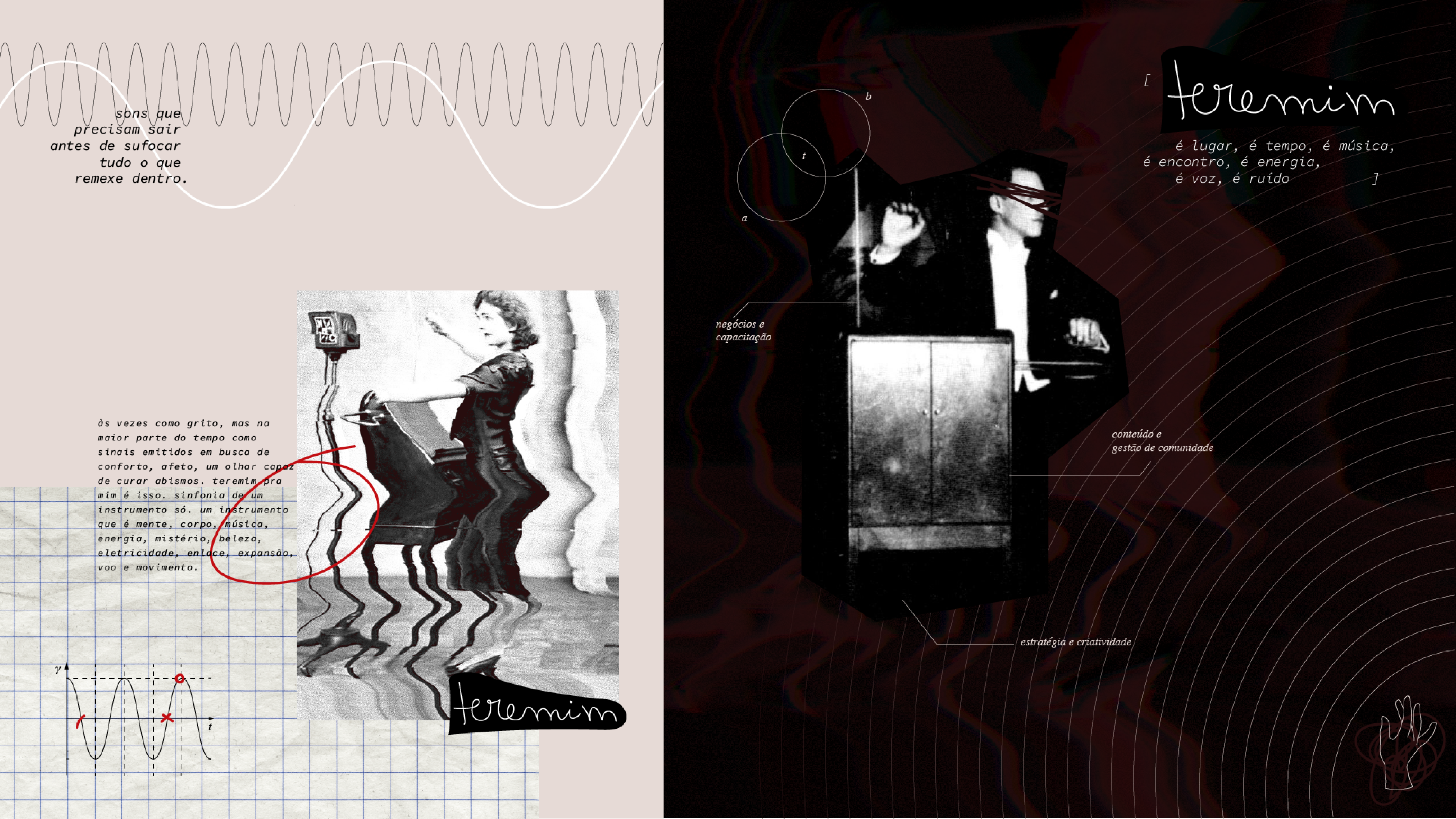

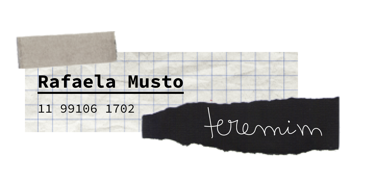
the logo was based on teremin’s founder rafaela handwritting and and abstraction of the instrument’s shape.
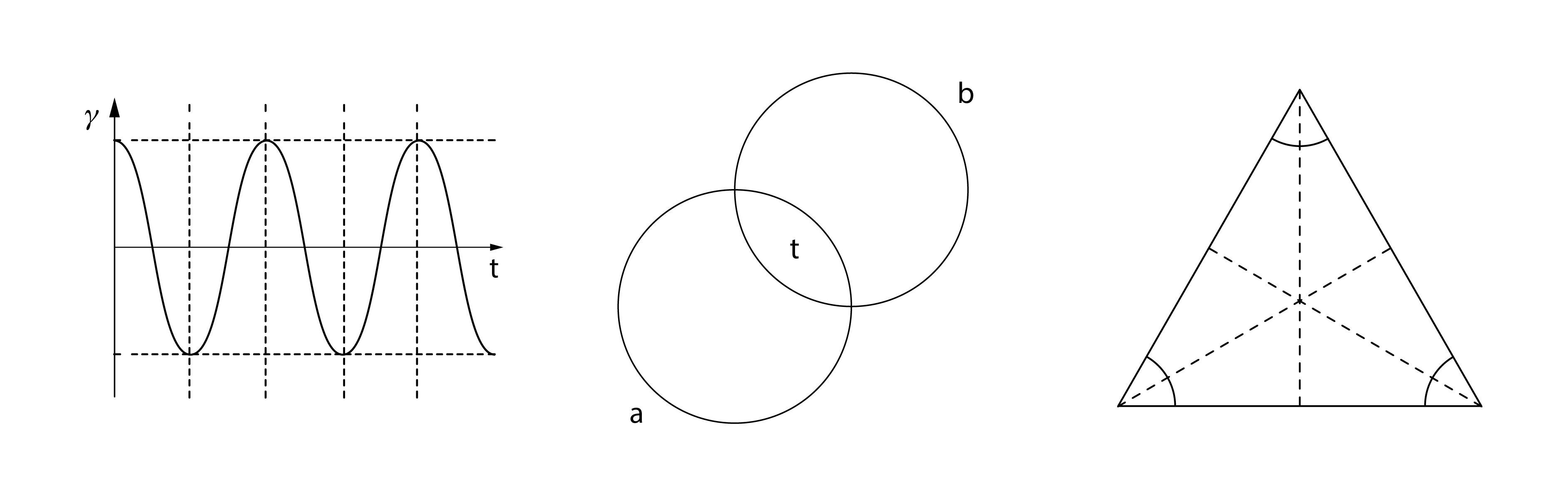
the music universe has a big influence on brand’s DNA. from the name to the graphic waves to the fanzine-like mood of our compositions. everything on teremin has a personal reason to be making this a very unique project.


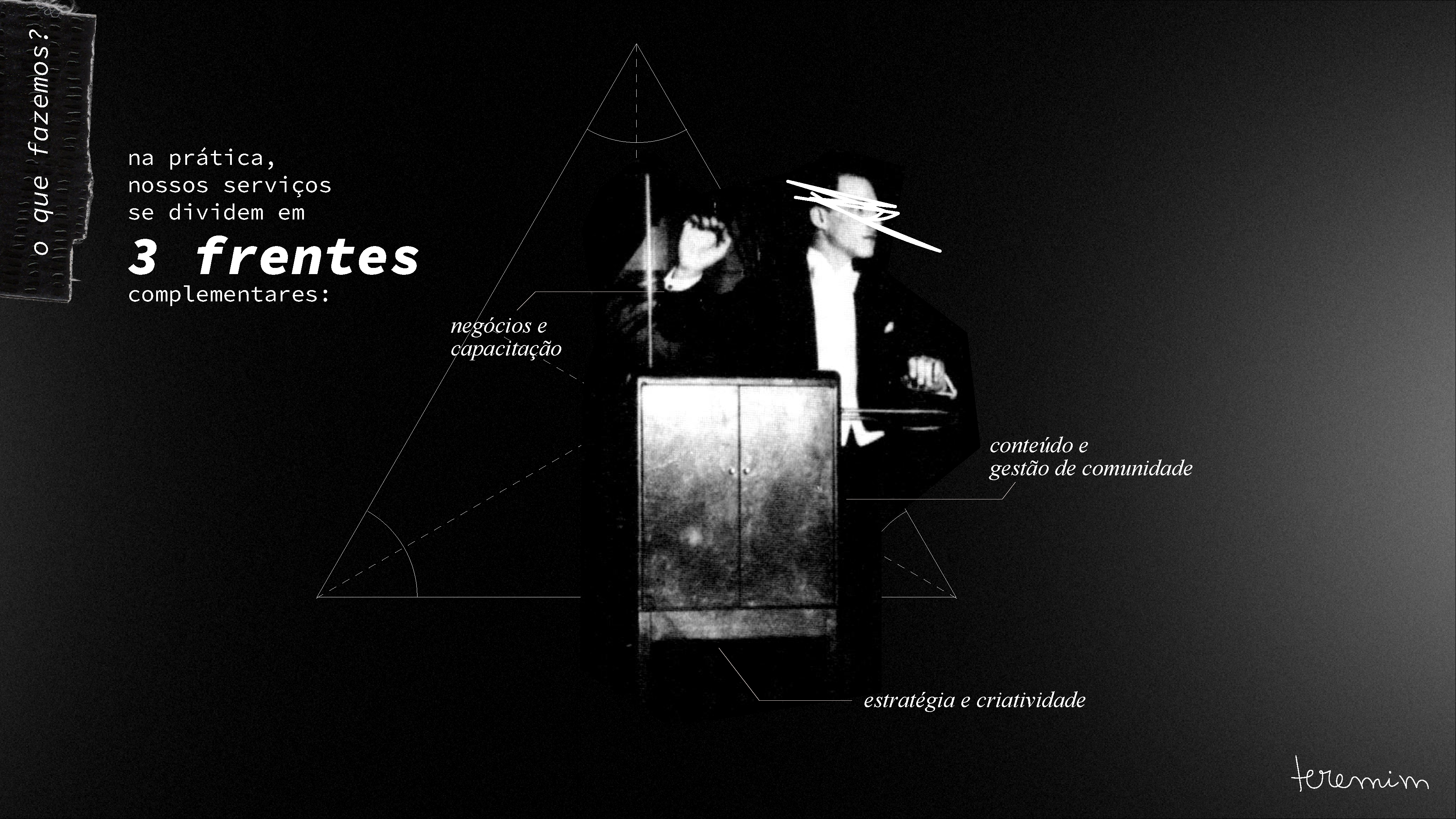
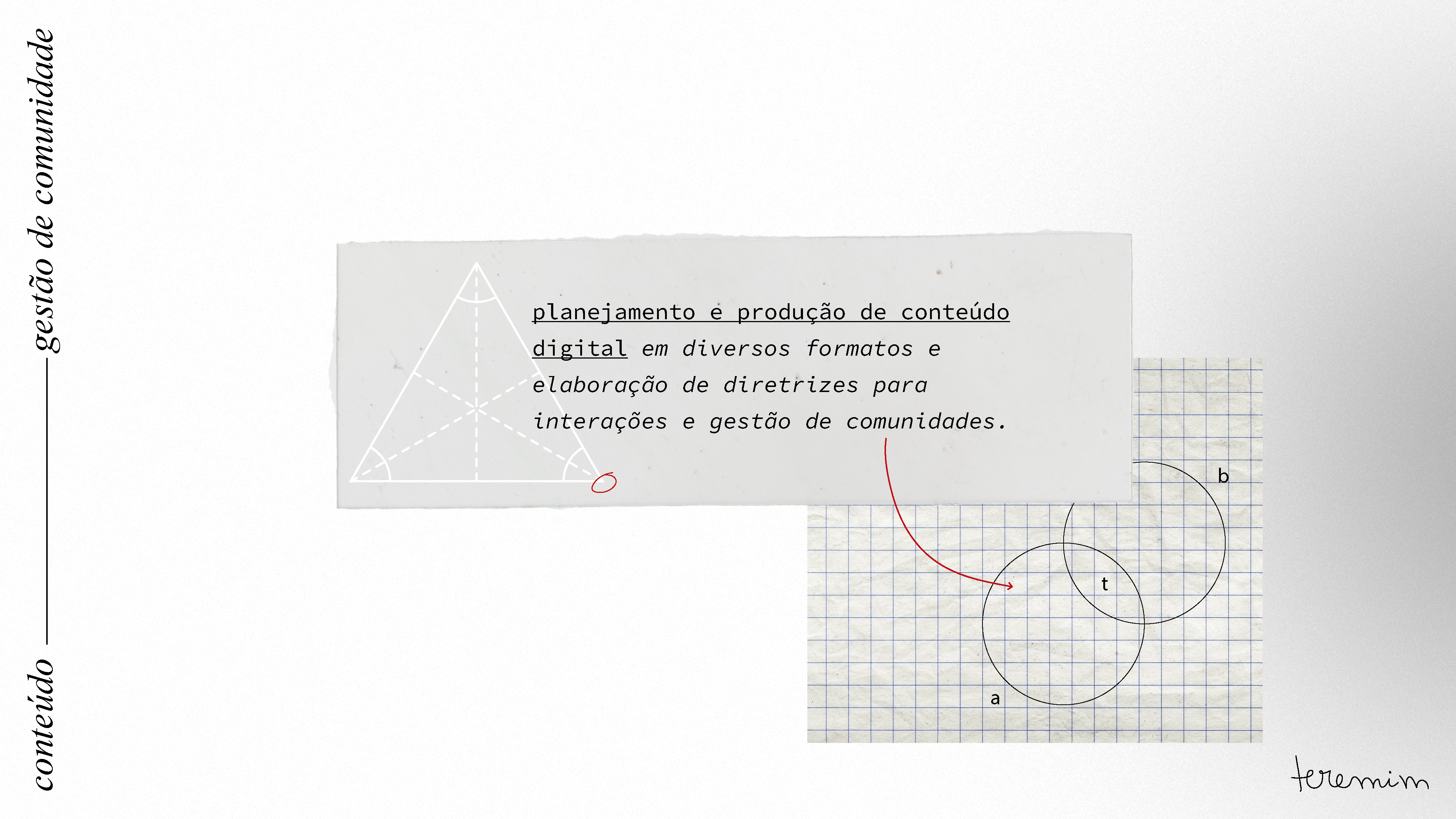


brand elements:


online presence @instagram, linkedin and e-mail signature: